An update for the Profile page

We have a surprise for you all today. We’ve updated and upgraded Fallen London’s profile page with some new features and functionality. Let’s take a closer look.

The new outfit display

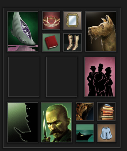
Besides showing large-format versions of item icons, the profile page now lets you choose which outfit to show off. You can choose which outfit to display by selecting it as a favourite in the Possessions tab. If no outfit is chosen this way, the profile page will default to the old behaviour of showing what you’re currently wearing.

The Scrapbook and Mantelpiece features remain the same; you can change which qualities to highlight on your profile from the Myself tab.

New character descriptions

The way your profile describes your character is now more adjustable. You can now choose which of your qualities gives you your adjective (‘Midnight’, on that screenshot). This can be adjusted through the storylet ‘Matters of Identity’, found in your Lodgings.

New gender options

You can now change your character’s gender in-game. This is also adjusted through ‘Matters of Identity’, in your lodgings. This comes to a slight change to how we treat gender by default. There are now two versions of the neutral gender, ‘individual’ and ‘individual of mysterious and indistinct gender’. The former is the default for players who chose the third option during character creation. You can change it to ‘individual of mysterious and indistinct gender’ in your lodgings at any time.

New header options

Your profile page header no longer shows you where you are – rather, you can pick a header to display. You can choose which header from the storylet ‘Matters of Identity’, in your lodgings.

A new Journal

The Journal now lets you choose a journal entry to ‘pin’, displaying it at the top. Pin your character’s greatest triumph or their most wet pathetic failure, we won’t judge.

This is only the beginning

We think this new profile page is an upgrade on the old one, and we look forward to seeing what you do with the new customisation options (you can view your character’s Profile by going to the Myself tab, and then selecting View Profile). We plan to add even more – more customization options, more headers, more ways to show off your character. Expect more expansion to the profile page, eventually.

16 Likes

The new profile page is quite stylish! And the option to change your character’s gender is likely a long-awaited one for many. My only complaint would have to be the lack of variety with headers, but I’m sure that will change in time!

1 Like

All is nice, but I think the name of the outfit should be hidden by default with an option to make it visible to other players.

3 Likes

My profile displays my title, is that new? If so, good change.

1 Like

Loving this update. Here’s hoping for more headers and the possibility of more scrapbook and/or mantlepiece slots.

1 Like

This is awesome!

One immediate suggestion: I wanted to pick the University as default header for my most scholarly character, but apparently that’s not an option yet. I think we need that, and also the wide Unterzee - for those of us who spend most of their time Zailing!

8 Likes

Oh also if anyone up at FBG remembers AK’s password then they might want to fix Citizen Mr Iron and their cousin Citizen Mr Eaten, the Unremarkable Profilenouns

5 Likes

I don’t know, that all seems fairly appropriate for Mr Eaten at least

5 Likes

I don’t know about you guys, but being described as ‘Unremarkable’ gives me a curiously warm and fuzzy feeling…

Only my Watchful has hit 230… might take a while to max out the other three.

I will pick one of the new Railway location headers for my profile page.

Minor complaint: you need to number icons next to the Mantelpiece/Scrapbook icons bigger.

And I personally don’t like asymmetry in the new profile page (spacing between Mantelpiece and Scrapbook entries).

For comparison, refer to a picture of the old version profile page in the wiki.
https://fallenlondon.wiki/wiki/Profile

2 Likes

this is really cool! it’s a shame my character who doesn’t want to marry (he’s not romantically-inclined) is going to have a blank spot on his page, but that’s quite minor.

2 Likes

Minor bug spotted: when you try to update your journal with a new entry, the small dialog box ’ Record This Snippet In Your Journal’ appears, but when you click ‘Update’ there is no confirmation message of the update, even though the entry gets added to the journal.

It’s still a work-in-progress, eh?

3 Likes

I have a suggestion, for the matters of identity option for adjectives, can I suggest adding advanced stats like zailor, red science, and shapeling arts? I think it would help set people apart if we had a few more options. I’d love to replace my watchful with shapeling arts.

2 Likes

Citizens! Bhahahaha, the Masters have been exposed to what they really are! :smiley:

4 Likes

I have been playing around with my Identity reputations, I believe the wiki entries need to be updated:

All my stats are (with items) above 230:
Watchful - Inescapable
Dangerous - Terrifying
Shadowy - Midnight
Persuasive - Otherworldly (not found in wiki, highest tier is 'legendary)

I’m a bit sad that only one reputation can be set for your profile now.

1 Like

can i ask a quick question?

what are the two empty blocks here supposed to be for? or am i not supossed to know that yet?

p.s. yes, i know my english is pretty bad, not my native language

2 Likes

Yeah, those two don’t open up until you progress the game further. If you’re interested, the first is Tier 3 Profession and the second is completing your Ambition.

I think that’s important feedback to FBG, missing slots should be handled more gracefully. Dynamic Tetris is probably really hard to implement, though.

5 Likes

okay, thank you for that. btw, how do you mark as spoilers?

2 Likes

Unremarkable, indeed! Bloody cheek, after all I’ve done for this lousy city!

2 Likes

I must say, I did not expect this kind of update and I want to emphasize very much, that I LOVE it.
Sure, I would like to see some of the improvements people have already suggested, but whether or not any of those are implemented, this update made my day.
Good job FBG!

9 Likes

To begin with I didn’t like how the outfit segment looks, but now I find I love it. Somehow it reminds me of the inside covers of the hardback Tintin books from when I was a child, which depicted a wall of different-sized portraits featuring characters from all the books. I used to sit and gaze at those for hours, trying to recall which story each was from. Something about the new arrangement just brings that all back somehow.

5 Likes