As the op, at the bottom of any post in one of my threads, i have the option to mark a post as an accepted answer. This is cool, i like the idea.
But the implementation leaves a lot to be desired, at least from my perspective
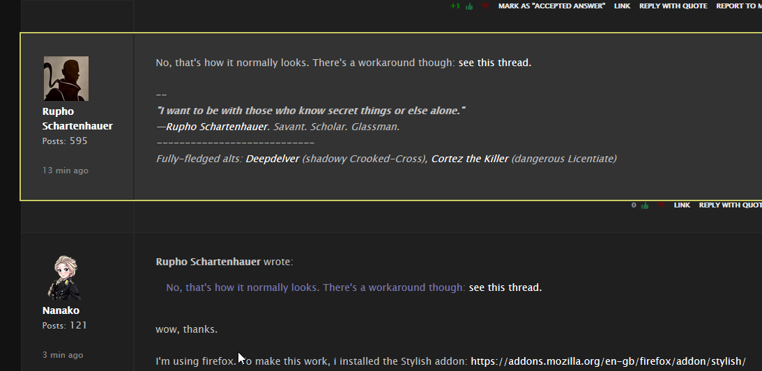
This is how it looks to me. It turns this wierd sickening ultrapale green colour.
This makes it difficult to read the text, almost impossible to read links and usernames, it clashes with the background horribly, and it actually physically hurts my eyes to look at it.
Is this intentional, or some kind of bug on my end? Who would willingly and intentionally design this?
Then i went to this forum, selected "Write new style", selected the option for "community.failbettergames.com", and pasted the code snippet in, like this