Ah, yeah. The gold is definitely what I’d call yellow if I didn’t know what it’s meant to be. Examples couldn’t hurt. ^^ Maybe after it’s all set up.
Ooh, exciting! I await the arrival of a silver, purple or black card with bated breath! I do love a bit of colour in the deck!
Though I’m not seeking, so I suppose I may not see all the colours.
I agree that the gold and bronze cards are both what I would call “yellow” (though the bronze is closer to what I would call gold, heh)
Interesting note: red cards appear to be usable with 0 actions…
This has been the case for a very long time, now.
Huh. Somehow, I did not realize this. I thought it was because you could see cards with 0 actions left.
Do they take your actions to -1?
No, they’re free if you use them at 0 (but they set your timer back to 9:59). As far as I’m aware it’s a known bug that is more or less treated as a feature.
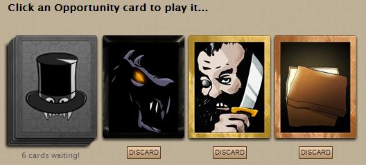
Well, I believe the bronze vs. gold debate is now settled. Quite nice, in my opinion.
Agreed - the new setup is rather pretty!
The black one… Very nice. Can’t wait to see what it holds.
A preview of the new colors side-by-side.
Edit: This is illustrative only, and not indicative of what borders belong with what cards. I.e. This is a mock-up using the exposed parts of the engine, and not real cards.
edited by Theus on 12/17/2013
Ooh, lovely. Very much looking forward to drawing some cards!
Oh my they jump as well:)
Also like the seasonal sign in page, very atmospheric.
Oooh, MUCH better! ![]() I do like the bronze. And I’m glad we kept the hat on the card backs, I would be sad to see that go.
I do like the bronze. And I’m glad we kept the hat on the card backs, I would be sad to see that go.
Oh hey, there are new profile options on the "Myself" page too! Excellent stuff.
edited by Inky Petrel on 12/17/2013
How exciting! I can’t wait to get back to London and play around with these.
The new borders are excellent. I’m less keen on the cards’ new mobility, though. It makes it harder to focus on the mouseover text, which is what I’m usually interested in if I move the cursor over them without clicking. It also feels out of place given the mouseover response of every other element of the interface – tabs, sidebar links, travel, perhaps not and branch selection buttons – highlighting, but no motion.
So, has anybody seen one of the new Black cards? I thought they would have been for SMEN content, but I suppose I was wrong.
[quote=Flyte]The new borders are excellent. I’m less keen on the cards’ new mobility, though.[/quote]It’s not so bad, I actually kind of like it. It would work better though if they shifted up, instead of diagonal to the right, though.
I like it! And no, haven’t seen a black card yet.
Heey the gold finally is gold and the bronze finally is bronze! Yay!
This is my favorite part of the whole thing!