The typeface for the game has changed, as well as the buttons. It looks really ugly. Thoughts?
Did it? It looks the same to me. Maybe I have to clear my cache?
I still miss the big, old, red "GO’ button, though.
I definetely agree, I think the new text without the higlighting looks really small and kind of weird in comparison to the, while not bright, still very colorful rest of the page, and I would definetely like the old one back.
And why would they actually remove the progress bars after actions those were great D:
edited by Moritz on 6/30/2015
Oh, I say. Along with new fonts, there are also more complete unlock requirements - some of which are rather confusingly worded (and coloured)?
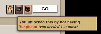
So this is new.
Wouldn’t that usually be green?
edited by The Machinist on 6/30/2015
[quote=ashdenej]Oh, I say. Along with new fonts, there are also more complete unlock requirements - some of which are rather confusingly worded (and coloured)?
[/quote]
[color=#0066ff]You’ll find more discussion of this in the Parabola forum![/color]
[quote=The Machinist]So this is new.
Wouldn’t that usually be green?[/quote]
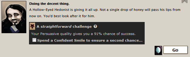
Yes, this is a problem. There’s no longer any visual indication to differentiate between a very likely success and a guaranteed success.