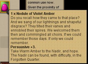
I have created a UserStyle to get rid of the visual clutter of all that extra bold text in the tooltips added in the recent update, for those of us who dislike it. This is what things look like with the style applied:

Comments with suggestions of other changes to make, or anywhere this might cause things to look wrong (so I should find another solution) are welcome.
Unfortunately, the challenge rating colors were changed at a level that cannot be affected by this method; it would require a custom extension which checks the provided percentage chance and then changes the preceding difficulty from diff0 to diff1.
You can get it from https://userstyles.org/styles/115931/fallen-london-tooltip-debolder; you’ll need the Stylish extension or something compatible for your browser to install it. This is a simple patch to the site’s CSS, it won’t affect anything except display.