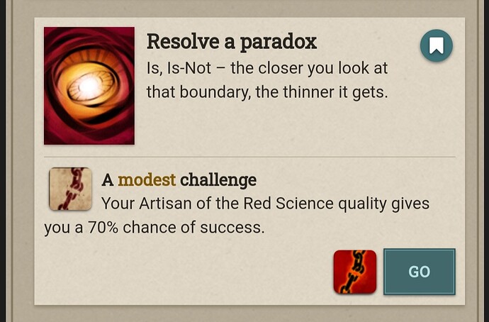
As for the red patch of SotD, I think it is transparent, nothing, since the background is red. However, to me black still expresses nothing/not-ness better.
I feel sort of the same about Red Science on reflection. While I liked the old wheel of fire dawn machine thing, the break chain makes it way clearer what Artisan of the Red Science does conceptually even if it feels less majestic and revelatory.
Looks like they changed the icons again. They look much better with the new colors.
Hm, interesting. The background now matches highway stats, bdr, and menaces. I like that, it visually communicates they are primary character stats. The fact they have different foreground colors is unique.
I had just finished getting used to the old new ones =P but overall I like it.
They look great now! ![]()
Much, much better! This is pretty much exactly what I would have suggested. I will say, I would find it fascinating to have been a fly on the wall in the meeting where the previous “bloody ochre and black” color scheme was decided and everyone nodded their heads and thought that was a fine idea. Truly baffling!
Big fan of the (re)redesign! The diff color palates makes them much easier to tell apart, and it’s easier to read the symbolism of the actual images as well now too
…though I still think Steward of the Discordance should be fully transparent rather than “nothing over the default background” :P
Oh hurray, they changed the ad icons! And they actually look great now! I honestly didn’t expect anything (I generally don’t believe game companies[or indid big companies in general]listen to community feedback unless it’s overwhelming)so this is a pleasant surprise!
That’s a cool twist! And I’m not mad about it. It’s not that I hate the black/red icons in and of themselves—they look metal.
Love the new version, now it’s stylish and easy to recognize while fitting in nicely with the rest of the panel!
I think the ‘Kataleptic Toxicology’ symbol color is a bit too close to the one used in the regular stats and menaces. But other than that - the new colour scheme is great and is a big improvement over the last design.
Oh, you’re in for a treat with Failbetter then! They almost always take player feedback into account! And as an aside, they are far from a big company. I’m fairly sure they have somewhere in the area of 20 employees.
"ohh, that’s awsome! every game company should be like that !"i say, staring daggers at bethesda.
20?! for a game developer? goodness! i don’t know much about the game industry, but that seems tiny.
Just saw the re-re-design of the advanced skill icons. I must say that I like the new art much better than the original icons, and the new colour much better than the redesign! Threading the needle perfectly between cohesive with other elements of the game and distinct enough to distinguish at a glance.
As I was one of the people complaining about the icon change, it only seems fair that I chime in to agree that the new colors are definitely much better! Very clear and readable.
Still old DIscordance icon was much better.
And maybe Shapeling Arts. No idea what the h__l is going on here.
I think it is both a nautilus and a Rubbery Man’s face

Or, conceivably, a squid doing tricks with a slinky.
I’m in favor of that.
Okay that is very cool. The optical illusion ‘read two ways’ images will never not be incredibly nice to see.
It always makes me wonder if I’m missing others
