If you haven’t done so, better clear your caches in browser because FBG is revamping some of their icons!
I have a hard time getting used to the new mysteries item because the lips look really rosy. The Cryptic Clue seem too bright as a small icon.
The new caperers look really neat! On the other hand I am missing the old one that looks like a zombie outbreak already.
[li]The art for Foreign Currency is also quite distinguishable in it’s colouration now, it’s oddly quite purple-ish. In general everything seems a tiny bit brighter, which I’m not certain fit’s the rest of the design, but whatever.
Small Cryptic Clue seems to beg for a redraw rather than mere downscaling, though. The symbols don’t translate well.
Oh, and the new Starveling Cat inventory/generic black cat looks wonderful too: edited by Jeremy Avalon on 5/8/2015
New icons today for Urchins, Magnanimous, the Cards so associated with Heart’s Desire and the Glass, the ubiquitous Lens icon (Nephrite Lens, Solving Cases, Patent Scrutinizer…), and Master Thief (and Hastily Scrawled Warning Notes).
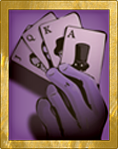
I’m particularly fond of the new, distinctly grubbier urchin, and of the fresh bait for us players of faro, baccarat, and certain games with stakes higher yet.
[li]
A little of column A, a little of column B?
When Sunless Sea was out a lot of new art was transported here, although that’s just art update in general.
Then you have the Prim Baronet, who suddenly got his portrait about… a month or two before the EF change.
Seems like nowadays we are moving away from sodding beige to sodding blue after Sunless Sea came out.
I agree the roses and the urchin need some adjustment though. The lack of contrast make the thumbnail kinda hard to see.


 >>>
>>>